The Art of Luca


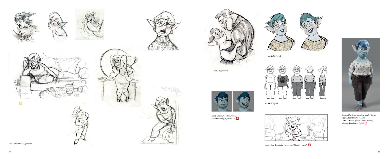
The Art of Luca has 176 pages, with about 66 pages dedicated to 2d character designs which is great.  The style of this film is probably one of the most distinct and different than any other Pixar film to date not counting some of their Pixar shorts. 


 To me it looks like the character designers were trying to go for this look and design rules that you see in many of the TV cartoon these days. Some people call it the "Calarts Style" even though I don't think it really started at Calarts. To me, it reminds me of a Wallace and Gromit smile. For an example of this almost 10 year trend in style all you need to do is look at some of the past cartoon shows from the last decade like Steven Universe, Gravity Falls, Gumball, Star vs the forces of evil, and the now infamous ThunderCats Roar. 


Now we have Luca which is a 3D version of this same style. This style has been hotly debated over the internet on weather people like it or not and some hoping that the trend will end soon.. The design language mostly has to do with the overly simplified bean shape of the head and the simplified mouth pickle shape which always seems to be open, and makes the characters look like they are constantly worried and nervous, or overly happy. Like I said many people like this style and it reminds them of their childhood. I'm happy to see Pixar change it up a bit,  play with different styles, and try to challenge themselves to push the boundaries of design.

I give the book a 3.5 out of  5


Art of Raya and the Last Dragon


Art of Raya and the Last Dragon has 168 pages, and this book has lots of great artwork especially character designs from Ami Thompson and we also get to see many great pictures from Shiyoon Kim. Both of them are the art director of characters for this film. There is even a few pictures from Cory Loftis and Paul Briggs. As always with me I wish they would focus more on the character designs, because that is what I love to see, and frankly I think most people that buy these books do as well. So, I always want more pages dedicated to just the character designs with bigger pictures. But in this book, we do get about 50 pages of character designs. Although some of the pictures are small, and some of them are pictures of the 3D model with 2D drawings on top of them, I do wish they would dive more into the very early stages and the experimental stage of them finding what the character might look like instead of us seeing the pictures of the characters final design.

Like in the previous books we still get a lot of pictures of color patterns, background objects and digital paintings. There are a few storyboard sequences scattered throughout the books as well. Overall, though this is a much better book than the art of Soul. They didn't waste a lot of the page space and they added a lot more artwork that more people would enjoy in my opinion.

I give the book a 4 out of  5

The Art of Soul


The Art of Soul has 176 pages, and there is about 35 pages dedicated to character design and that is being nice. There wasn't one section for character designs in the book like in most, they a sprinkled all throughout each section. The book mostly contains backgrounds, some storyboards, and experimental designs for the spirits and the spirit world and what it could look like.  

I was really disappointed in how they used the space in this book. For example they show this wonderful group lineup of the high school kids by Tom Gatley  but instead of using the whole page, they shrunk it down so each character is an inch and a half big so you can hardly see the details. And then funny enough, the page before has a picture on an empty classroom which takes up half of the page, which could have been left out to make room for the group of high school kids picture to be a whole page if they switched some things around. There are many frustrating things like that throughout the whole book. 

There are some amazing pictures by Rachel Xin, Grant Alexander, and Nancy Tsang that I would've loved to have seen much bigger, but instead they were shrunk down surrounded by empty wasted space. And then there were these empty abstract paintings (like the cover of the book) blown up to fit the whole page. 

Whomever decided which pieces of artwork to show as well as the layout designer of this book should never do another art books again. It sounds harsh, but this is probably the worst "Art of Books" I have seen.


I give the book a 1 out of  5

The Art of Onward


The Art of Onward Is a really impressive book full of artwork.  Out of  the 176 pages I would say up to 60 pages are dedicated to character design.  Not only that, but most pages have multiple pictures of them working out what the design could be, before they finalize the character design. This is the kind of stuff we all love to see.

It looks like Grant Alexander, Chris Sasaki, Maria Yi, and Matt Nolte, are doing the bulk of the character designs on this film. They all seemed to be on the same wave length with the design rules, even from the start you can tell that they got the look and feel of this film pretty quickly.   I'm so happy to see more artwork from Matt Nolte, he is one of my favorite artists and I am so happy they show a lot of his art in this book.  Overall It's a pretty packed book full of good stuff


I give the book a 4.6 out of  5


Matt Nolte, digital.


Spread only of Laurel.


Manticore’s Tavern characters.